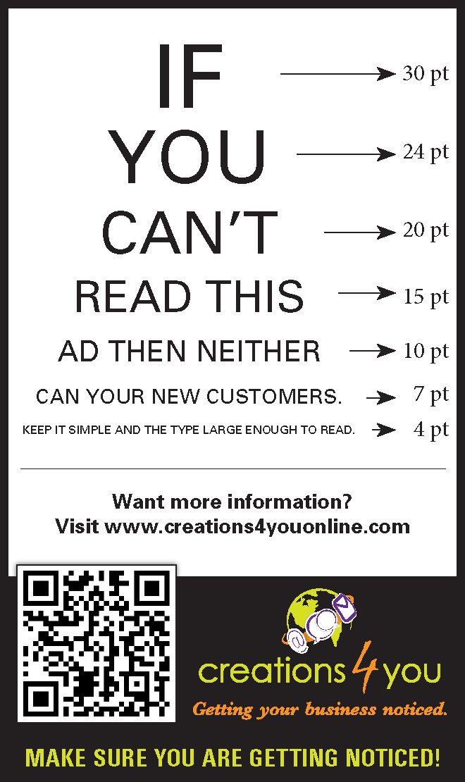
Many times we have ads that are done for us, and we are proud of our business and try to put everything we can in an ad. Most of the time to much information and the type ends up being small. I have noticed that it doesn’t matter if it is a full page or a small ad, we all (well, most of us) tend to put a ton of information. Thus making the type so small some people find it very hard to read.
General rule of thumb is don’t go below 7 point size on your ads. Smaller ads need larger fonts to pop off of the page against all of the other ads that are there. If you saw this ad in a print version, then you saw how hard it was to read the last line. Below are the point sizes for reference on the print ad. You can print this ad by clicking on the image below for the PDF of this ad, print it at actual size and you can see for yourself the size of the fonts.


